
VisitHabibi Platform Redesign
Transforming the travel discovery website into a modern, intuitive, and engaging digital experience.


Duration
3 Weeks
Client
Visit Habibi
Team
Solo Designer
My Role
UX/UI
Screens
25+ (Mobile+Web)
About VisitHabibi
VisitHabibi is an adventure experience platform dedicated to showcasing the thrill of Dubai. From desert safaris and dune bashing to yacht rides and sky-high adventures, it connects travelers with unforgettable activities in the city.
While the platform offered exciting experiences, its earlier website faced challenges with cluttered layouts, unclear navigation, and scattered information. This made it harder for users to explore and book the right adventures with confidence.
To stand out in a competitive travel space, VisitHabibi needed a modern redesign that highlighted its mission.
Goal of the Redesign
My goal with the VisitHabibi redesign was to turn their adventure website into a seamless, trustworthy, and exciting booking platform that matches the thrill of Dubai’s experiences.
The redesign focused on:
Building Trust Through Clear Storytelling: I restructured the content flow to highlight authenticity, safety, and transparency using reviews, and clear details to build confidence with international travelers.
Streamlining the Booking Funnel: The booking journey was simplified to reduce friction, encourage quick decisions, and increase booking value with relevant add-ons and personalized suggestions.
Designing a Mobile-First, High-Performance Experience: Since most travelers book on the go, I ensured the platform was mobile-first, fast-loading, and SEO-friendly to capture global audiences searching for Dubai activities.
Process/Approach
Competitive Analysis
Before starting the redesign, I conducted a competitive analysis and compared VisitHabibi website with other Dubai adventure and experience booking platforms.
Competitors
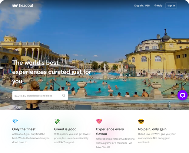
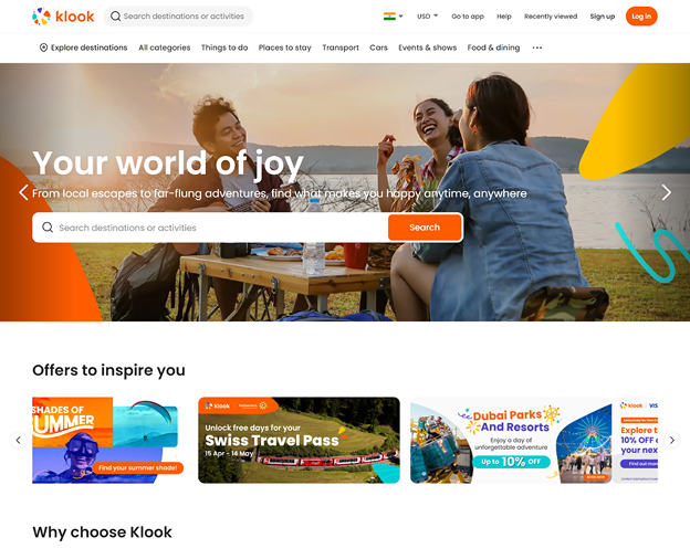
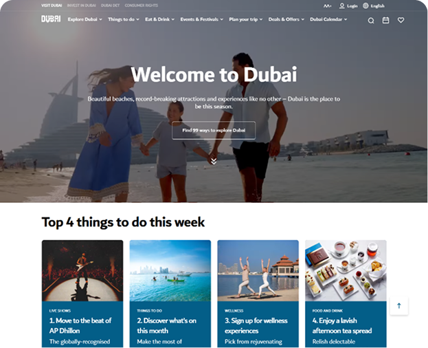
Immediately, I noticed a few key differences:


Define
From the competitive analysis, it became clear that VisitHabibi needed a redesign focused on trust, clarity, and a seamless booking flow. To guide the process, I mapped out a typical traveler’s journey
User's Journey Map
Sarah, 29, Traveler from London, wants a desert safari at the best price without extras.


Wireframing
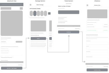
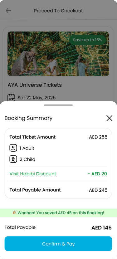
I started with low-fidelity wireframes to simplify the ticket discovery and booking flow. Since most users book on their phones, I used a mobile-first approach, focusing on clear CTAs, and a easy checkout flow.
Wireframes helped set a clear hierarchy, highlight key actions like Search and Book Now, and plan reusable components (cards, filters, reviews, trust badges).
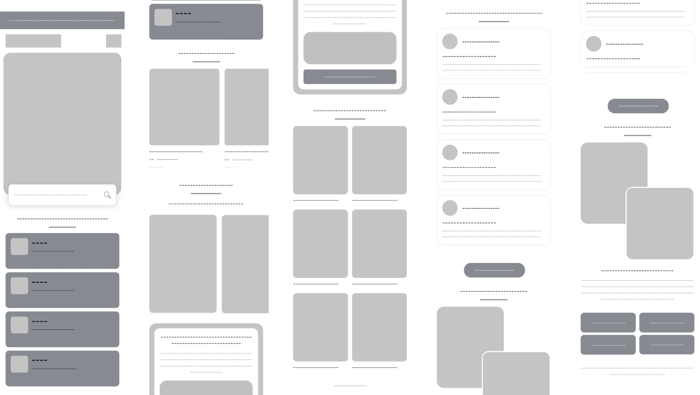
Adventures into tickets with ease

High-Fidelity Design
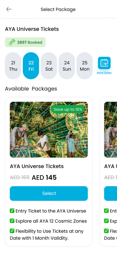
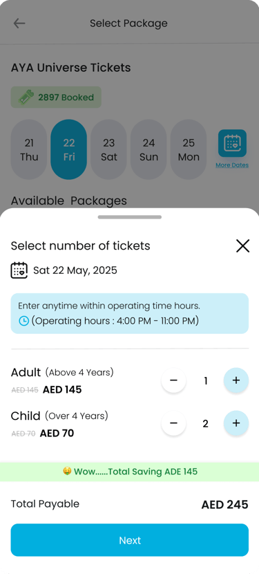
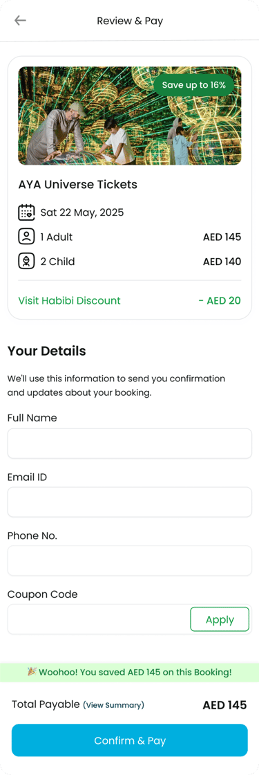
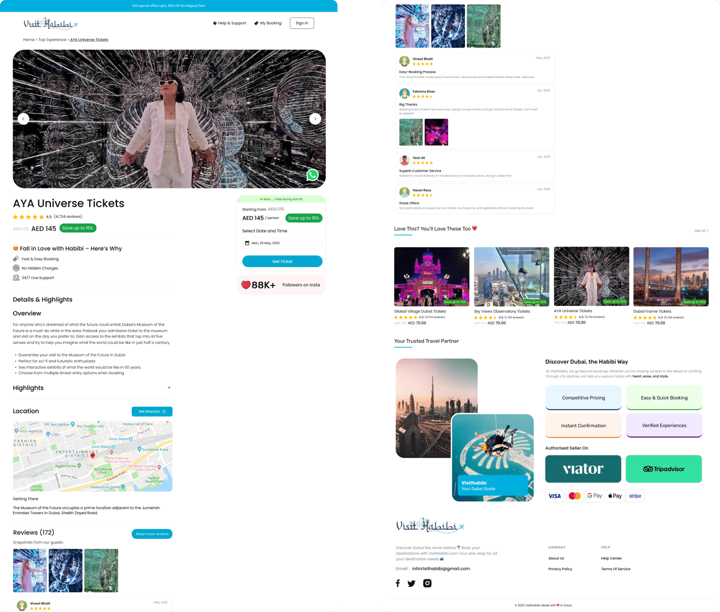
The wireframes were refined into a polished, mobile-first design. With clear hierarchy, a simplified booking flow, trust-building visuals, and a consistent brand look, the final design makes ticket booking fast, engaging, and reliable.






Website View
While the design prioritized mobile-first booking, the desktop version was optimized to maintain the same clarity and flow. A clean layout, bold visuals, and consistent navigation ensure users get a seamless experience whether booking on mobile or browsing on larger screens.
Web UI Design


What Did I Learn?
Through this project, I refined my expertise in mobile-first UX design, focusing on creating intuitive booking flows optimized for high conversion.
I gained valuable insights into structuring clear CTAs, reducing friction in the checkout process, and applying a design system that balances visual consistency with functional clarity.
This experience reinforced the importance of aligning user needs with business objectives to deliver a seamless and trustworthy digital product.
Every ticket tells a story, every design fuels the journey🚀
Let’s Create Something Amazing Together
Great design grows when shared. I’m open to collabs, side gigs, or bold creative adventures.
I hope you enjoyed exploring my portfolio! Have a fantastic day ✨